Overview
Garden Sauna is a Denver-based sauna company centered around wellness, ritual, and connection to nature. The goal of this project was to create a logo that felt warm, organic, and elevated—balancing the calming qualities of a garden with the intensity and energy of a sauna experience.
The Challenge
The primary challenge was to visually combine two contrasting ideas:
•Nature & growth (garden, calm, grounding)
•Heat & transformation (sauna, flame, steam)
The identity needed to feel welcoming and refined without becoming overly rustic or overly modern.
Concept & Visual Direction
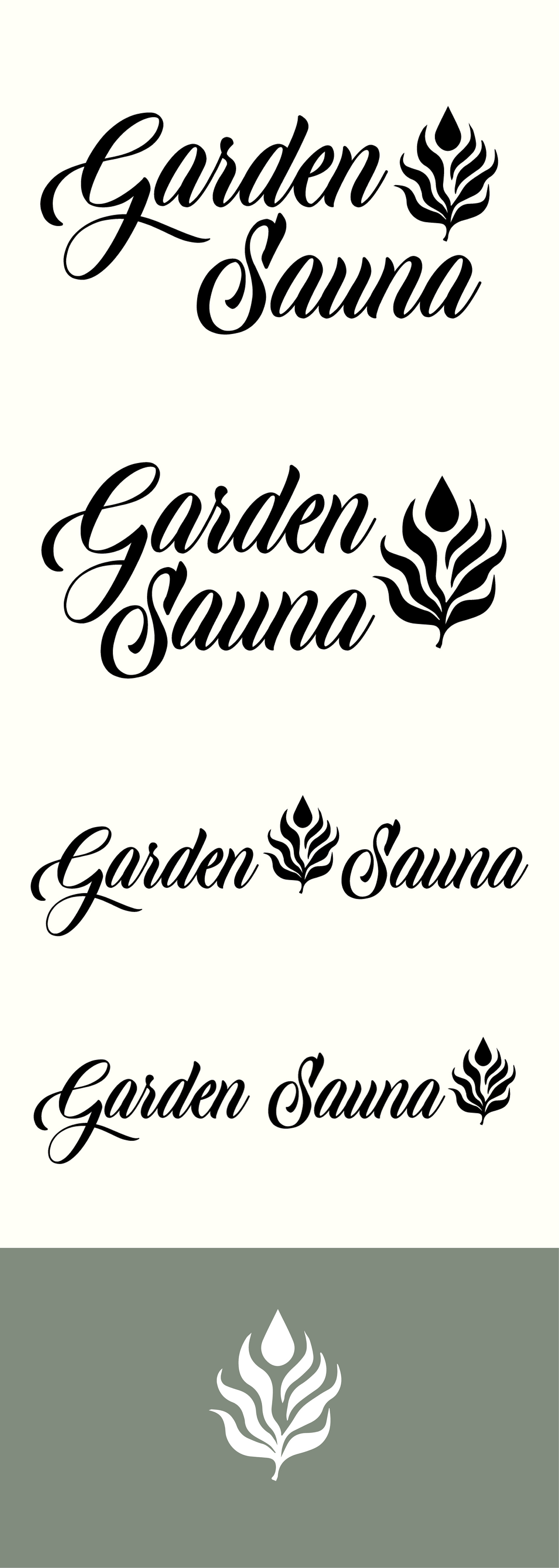
The logo mark was designed to reference a leaf, a flame, and rising steam in a single, simplified form. This abstract approach allows the symbol to communicate warmth and growth without relying on literal imagery.
The fluid shapes and upward movement suggest heat and energy, while the botanical influence reinforces Garden Sauna’s connection to nature and wellness.
A flowing script wordmark was chosen to introduce warmth and a human touch, complementing the organic form of the icon. The contrast between the expressive typography and the bold, simplified mark helps maintain clarity and balance across applications.
Logo System
The logo was designed as a flexible system with multiple lockups:
•A primary horizontal wordmark with icon
•A stacked version for compact spaces
•An icon-only mark for signage, social media, and small-scale applications
This flexibility ensures consistency while allowing the brand to adapt across digital and physical environments.
Outcome
The final logo feels calm, confident, and grounded—reflecting the restorative nature of the sauna experience while remaining visually distinct and versatile. The identity is designed to scale easily across signage, apparel, web, and merchandise without losing impact.
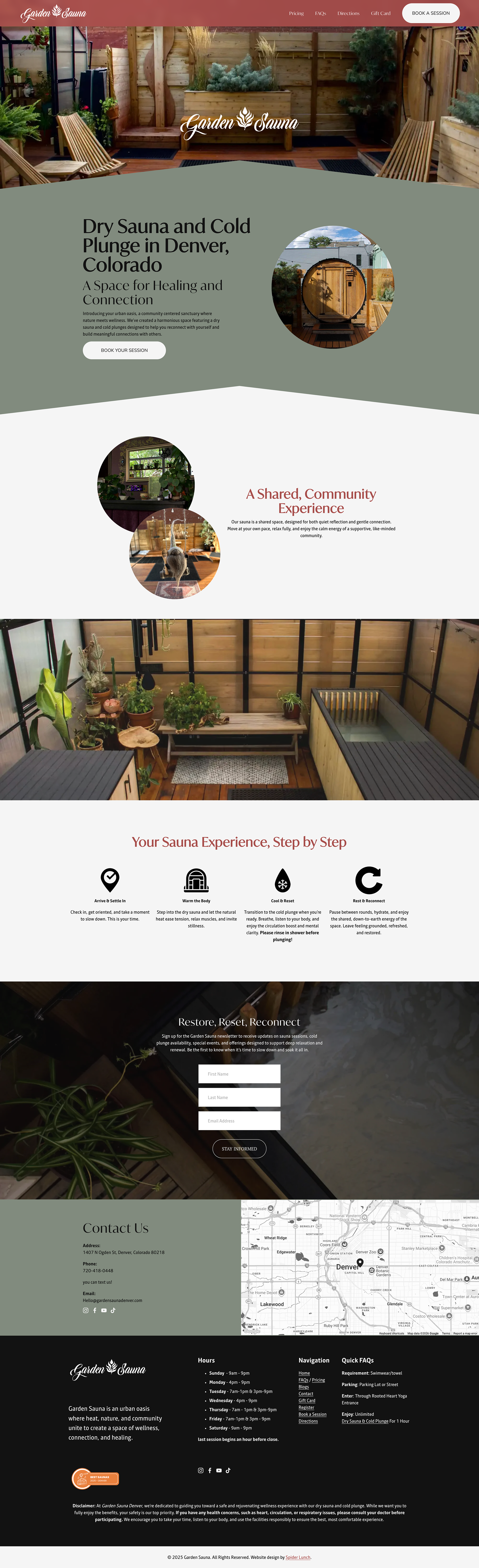
Website
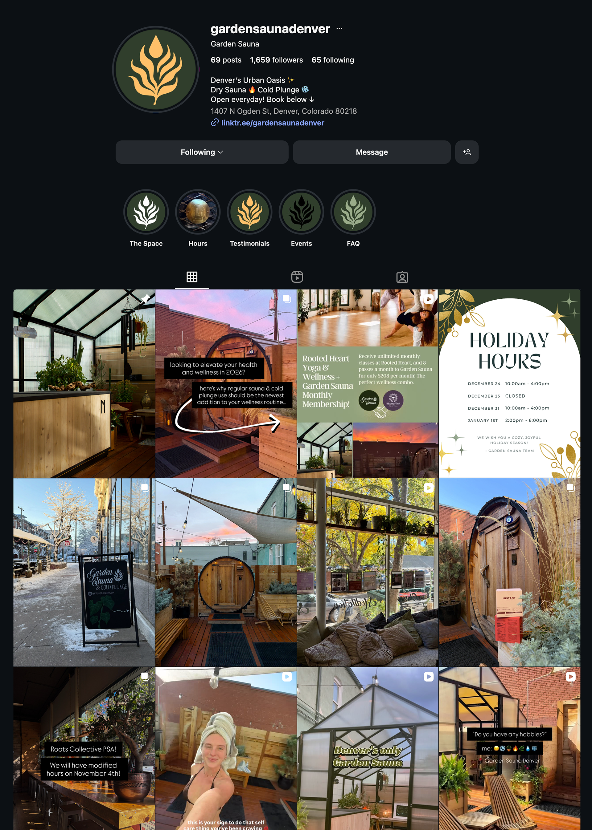
Instagram